The Daily Click ::. News
 

Project update: Mammalian & Liam: Back in action
News posted 7th December, 2008 by -Liam-  
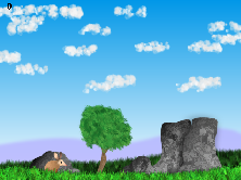
Hello everybody! Do you remember this project I posted about a few weeks ago; Mammalian? Well Dynamite has been hard at work, going into overdrive one might say, and really done a number on the graphics! Here is the original video again and this is a link to the new graphical style: Here.

What do you guys think? Looking really great in my opinion! :)

On a side note let me say sorry for my brief disappearance! I'm back in action now and alive 'n' kickin'. :)


Posted by alastair john jack 7th December, 2008

Good to see you liam
 
Posted by AsparagusTrevor 7th December, 2008

Yeah Liam, sorry about that whole kidnap thing. Hope we can work past that.
 
Posted by Jon C-B 7th December, 2008

Good to see ya Liam! The new graphics for Mammalian look nice I guess, but the original stuff looked WAY better.
 
Posted by W3R3W00F 7th December, 2008

Phew! He DIDN't die after all! LOL
 
Posted by Fifth 7th December, 2008

...What's this now? There's no link to the actual project?
 
Posted by Dynamite 7th December, 2008

I haven't started a project for this here, well not yet. I just showed Liam my game and we agreed to put it up here on The Daily Click
 
Posted by Joellie 7th December, 2008

Wow im really impressed with the video, it looks really cool
 
Posted by Marko 7th December, 2008

Not sure which i prefered, the old video style graphics or the shiny new ones in the pic. Good thing is they both look great so it doesn't matter to me which one Dynamite goes with!

Good to see you posting again, -Liam-!
 
Posted by alastair john jack 7th December, 2008

I like the new graphics, makes it seem less like a kyntt stories rip off.
 
Posted by Marko 7th December, 2008

True, i forgot to mention that the first style was too close to Knytt for my liking.
 
Posted by Simon Czentnár 7th December, 2008

The new graphics look quite nice!
 
Posted by Bricnic 7th December, 2008

Looks like the paintshop pro grass.
 
Posted by columbo borgi :C 7th December, 2008

Liam likes this game soo much coz its MammaLiam... :C

it was a bad joke? :C
 
Posted by Ecstazy 7th December, 2008

I don't know, the new style looks like it's suitable to some Flash puzzle game with a unique concept, and less for a platformer.
 
Posted by Dr. James MD 7th December, 2008

I prefer the old look, I must say! It seems that more could be done with the first style.
 
Posted by -MacAdaM- 7th December, 2008

I like the first style. :3
The new one is like... too realistic for me.
 
Posted by OMC 7th December, 2008

I'd have to see both in motion, but I do say that the first one seems to pull my favor...
 
Posted by Sketchy 7th December, 2008

I prefer the old style too. Either way, the gameplay looks great.
 
Posted by Ski 7th December, 2008

From the new screenshot I don't see how it will play anything like the original game?
 
Posted by Aptennap 7th December, 2008

I prefer the new style, but I'll have to see it in action.
 
Posted by BeamSplashX 7th December, 2008

LIIIIIIIIIIIIAAAAAAAMUUUUUUUU!

Welcome back.
 
Posted by Silveraura 7th December, 2008

I agree with Adam here. The new style looks great, but how in the world is the game going to play anywhere near the same? Especially after I saw the animation video. It looks like a completely different game.
 
Posted by Dynamite 7th December, 2008

The first one WAS the completely different game.
The second one is the type of game I wanted to achieve.

Thanks for the cool comments guys!
The first one was more of a challenge, because it had a unique style to it. I threw that away because the gameplay was very LIMITED.

But for the second one, the graphics might be different but the gameplay will have endless possibilities. You guys will enjoy the second one.

Besides, once you play it you should ask yourself;
"I wonder how this game would look if Dynamite stuck with the first graphic style?"

I will stick to the new graphics for the stories and the gameplays purpose
 
Posted by Marko 7th December, 2008

Hmmmm, can i be cheeky and ask you to make both types of games?!
 
Posted by BeamSplashX 7th December, 2008

I'm glad you decided to keep your style. Sometimes you don't give people what they want now, you make them want something new.
 
Posted by OMC 11th December, 2008

:| It seems kind of generic... Like a compilation of Flash resources. How can having a more complicated art style make the gameplay MORE limitless? It seems that with click games, that is generally not the case. Just my thoughts. Go with whatever you want.
 
Posted by Dynamite 13th December, 2008

Oh the gameplay will be better then the art..I will guarantee that


Author Info

Advertisement

Worth A Click